When the product is the star of the show, it’s a no brainer to create a brand identity that highlights the client’s creativity. Read our success story below to see how we made this baker’s brand instantly more memorable than all the other cookie cutters in the marketplace.
SUCCESS STORY: LOVE.EAT.CAKE BY LISA
Beautiful branding
that takes the cake!


CLIENT
Love.Eat.Cake by Lisa
PROJECT
Branding
PROCESS
Brand Strategy
Brand Identity
DELIVERABLES
Logo Design
Packaging


THE CLIENT
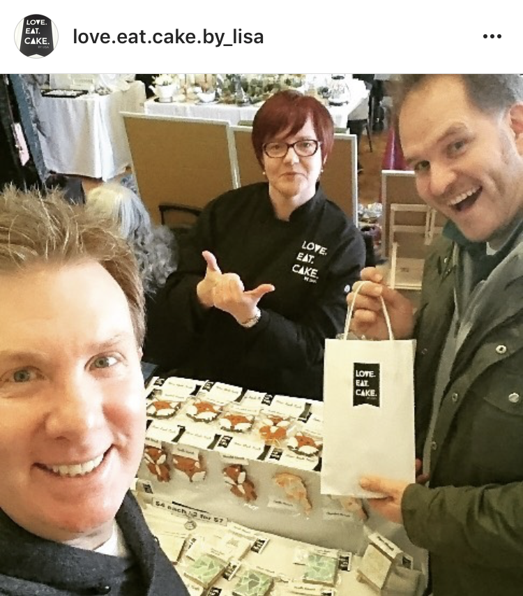
Lisa Roberton is the director of Love.Eat.Cake by Lisa. A lover of food and passionate about helping others, Lisa creates beautiful, home-baked biscuits and cakes for corporates and individuals. Part of the proceeds from the sale of her goods raise money for various charities that Lisa is involved with.
THE CHALLENGE
When I met with Lisa, I fell in love with her home-made treats. Not only were the ingredients simple and natural, the biscuits were absolutely delicious and so exciting to look at!
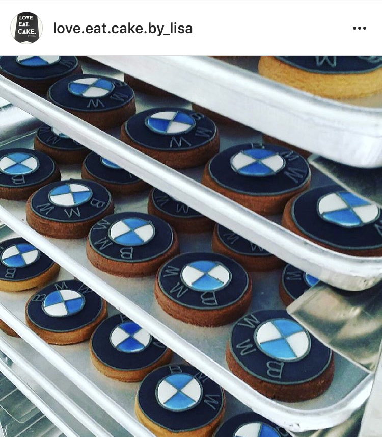
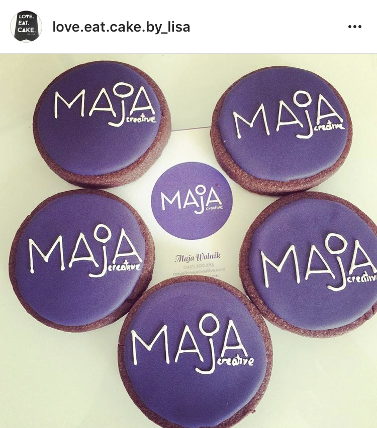
LOVE.EAT.CAKE specialises in customised biscuits – Lisa infuses each order with creativity and personality and can create a biscuit in any shape or design you like – cats, dogs, basketballs, skulls, anything! She also bakes biscuits with your company logo!
Lisa wanted to hit craft and artisan markets to sell her range as well as appeal to the corporate market for her branded biscuits – the challenge was to develop a brand identity that would capture her creativity but most importantly be memorable in an already crowded cake and biscuit market.
THE BRAND STRATEGY
The competitor research for this project revealed the most valuable insights – almost all of Lisa’s competitors and others in the biscuit and cake space had very similar branding – mostly cutesy illustrations of cakes and cupcakes, swirly lettering, polka dots, stripes and candy colours.
We wanted to:
- Make sure that Lisa’s branding really stood out from the crowd – literally – to be easily recognisable and memorable for repeat orders for special birthdays and occasions
- Communicate that Lisa’s biscuits were home-made from scratch
-
Capture Lisa’s creativity in biscuit design
-
Create an artisan brand that would appeal to a broad range of individuals of all ages
- Makes sure the brand looked professional and credible enough to appeal to the corporate market
THE OUTCOME
“In approaching this concept I really wanted to create something that was really different, completely opposite and unexpected to what is prominent in the category.Inspiration was drawn from the cafes of Paris, where the streets are lined with beautiful artisan patisseries – each cake is a work of art. This reminded me of Lisa’s work – she is so creative and puts so much care and attention into every single biscuit she designs. In Paris, you get a beautiful white box when you purchase your little cake. If the cake is a gift, they wrap a black ribbon around the box. It’s the most beautiful surprising delight when you open it up and see a colourful, edible creation. This is what I envisaged for LOVE EAT CAKE – the logo idea came from a simple black ribbon to suggest that LOVE.EAT.CAKE is a treat. This also came from one of the insights from our brand strategy workshop – because of their personalised and customised nature, most of Lisa’s products are mostly intended to be given to others as gifts and treats. – Maja Wolnik, Creative Director
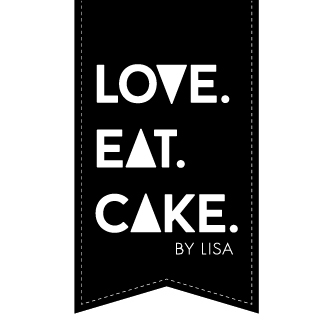
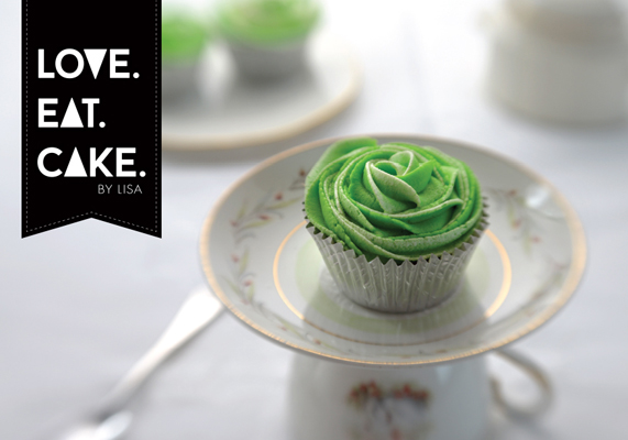
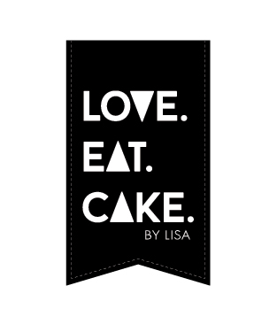
The words LOVE.EAT.CAKE were designed on a simple, black ribbon, on a white background. This allows Lisa’s biscuits to have prominence, her creativity to be showcased and the black icon contrasts against her amazing bright colourful biscuits making them literally pop to differentiate her from the competition.
We also wanted Lisa to promote her creative biscuit designs through Instagram and Facebook and this logo would allow her to showcase her biscuits creatively while creating prominent branding with the contrasting black and white logo.
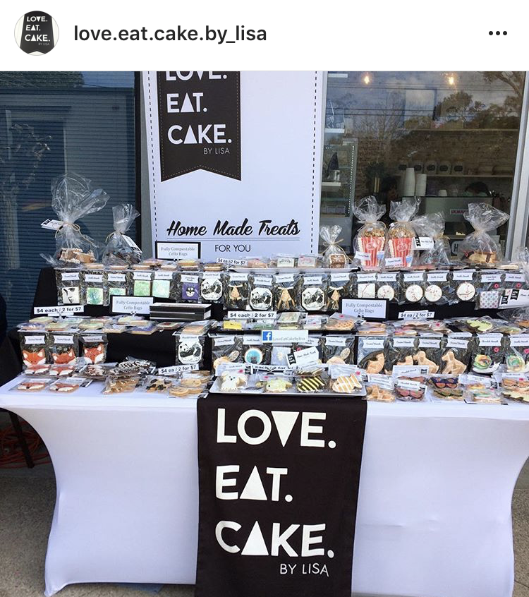
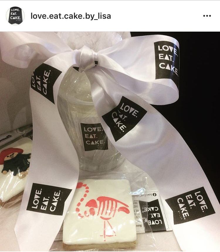
At point of sale, we wanted Lisa’s biscuits and creativity to also shine, so we designed a simple clear cello bag with a simple header card on top. A ribbon shaped sticker announces which type of biscuit the customer is purchasing.
As the LOVE.EAT.CAKE popularity and business grew, we’ve been able to help Lisa further with the management of her brand by developing a beautiful branded biscuit gift box (the original Parisian vision has come to life!) as well as branded aprons, bakers uniform, carry bags and branded banners and signage for her weekly market stall displays.
The corporate side of LOVE.EAT. CAKE is also booming, we’re loving the designs Lisa has created for clients such as BMW and Mini Cooper – we’re so excited to see her delicious growth!
CLIENT FEEDBACK
how the project was received
THINKING ABOUT BRANDING?
WE'D LOVE TO HELP.
BRAND DISCOVERY CALL
Book in for your Brand Discovery Call and find out how our creative team can support you in building a meaningful, memorable, iconic brand.
PARISIAN INFLUENCE
The branding was inspired by the artisan cake makers of paris.
BLACK & WHITE
Simple, timeless, shaped like a ribbon, this logo looks like a delicious treat that’s good enough to eat!
