Capturing their ethos of premium food and local produce, we created a symbolic
brand for Harvest Halls gap that evokes a feeling of quality, simplicity, community and agriculture. See how a simple logo mark can become the hallmark of your brand across multiple touch points.

SUCCESS STORY: HARVEST HALLS GAP
PLANTING THE SEED OF CAFE CULTURE IN COUNTRY VICTORIA.
CLIENT
Harvest Halls Gap
PROJECT
New Branding
PROCESS
Brand Strategy
Brand Identity
DELIVERABLES
Logo Design
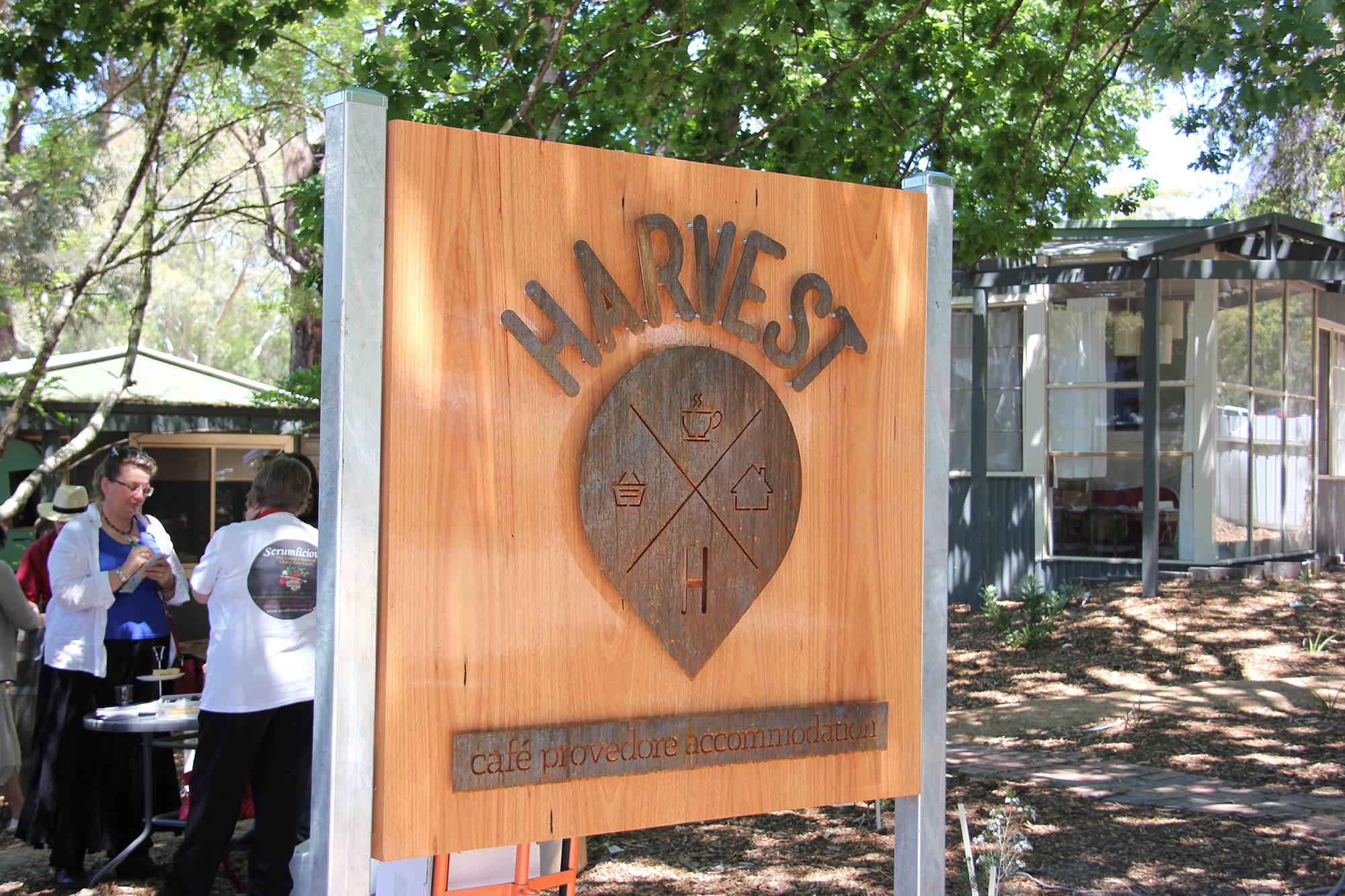
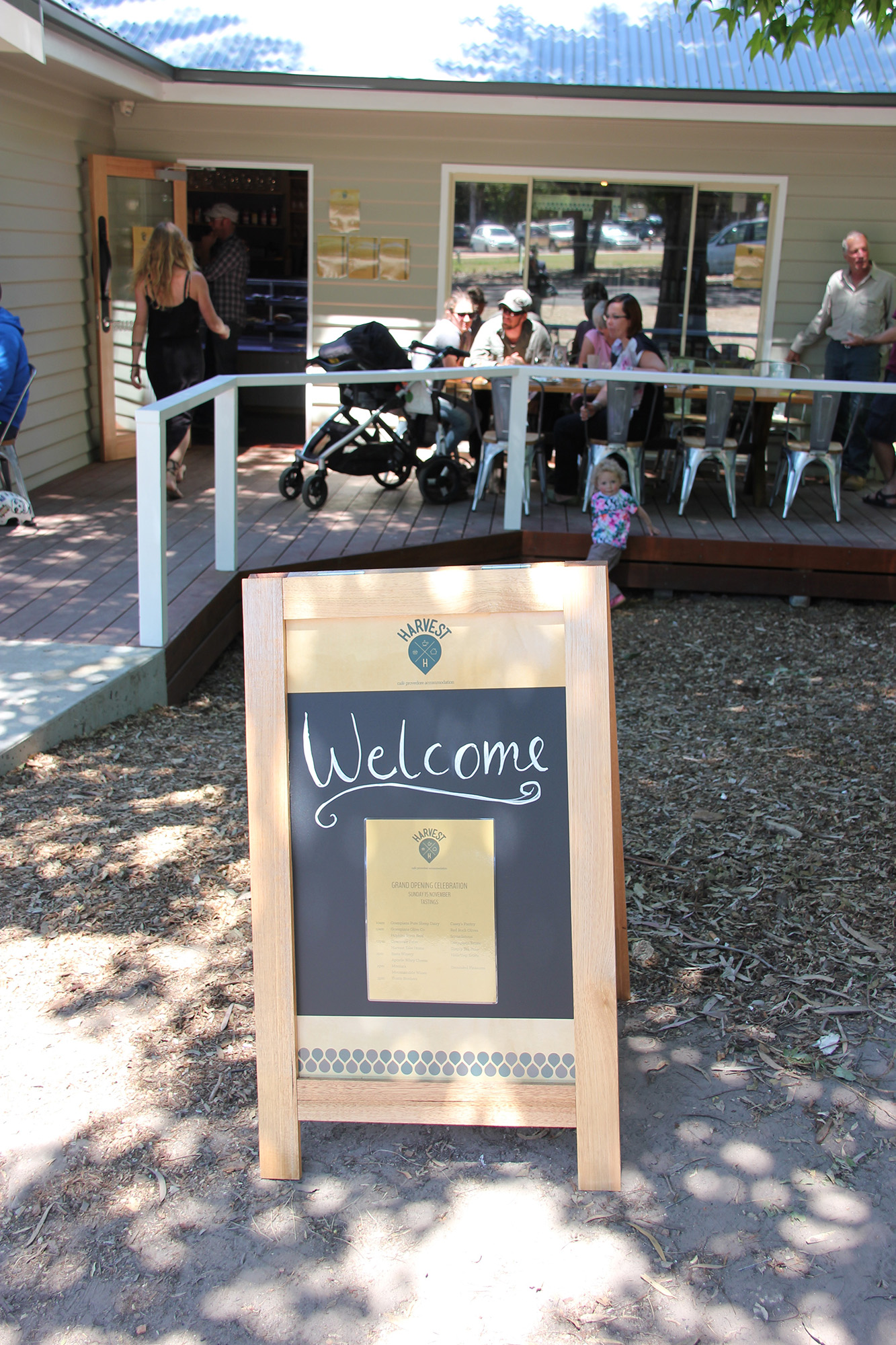
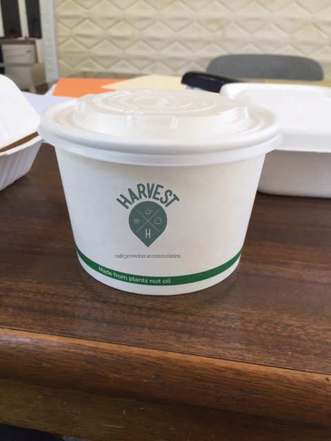
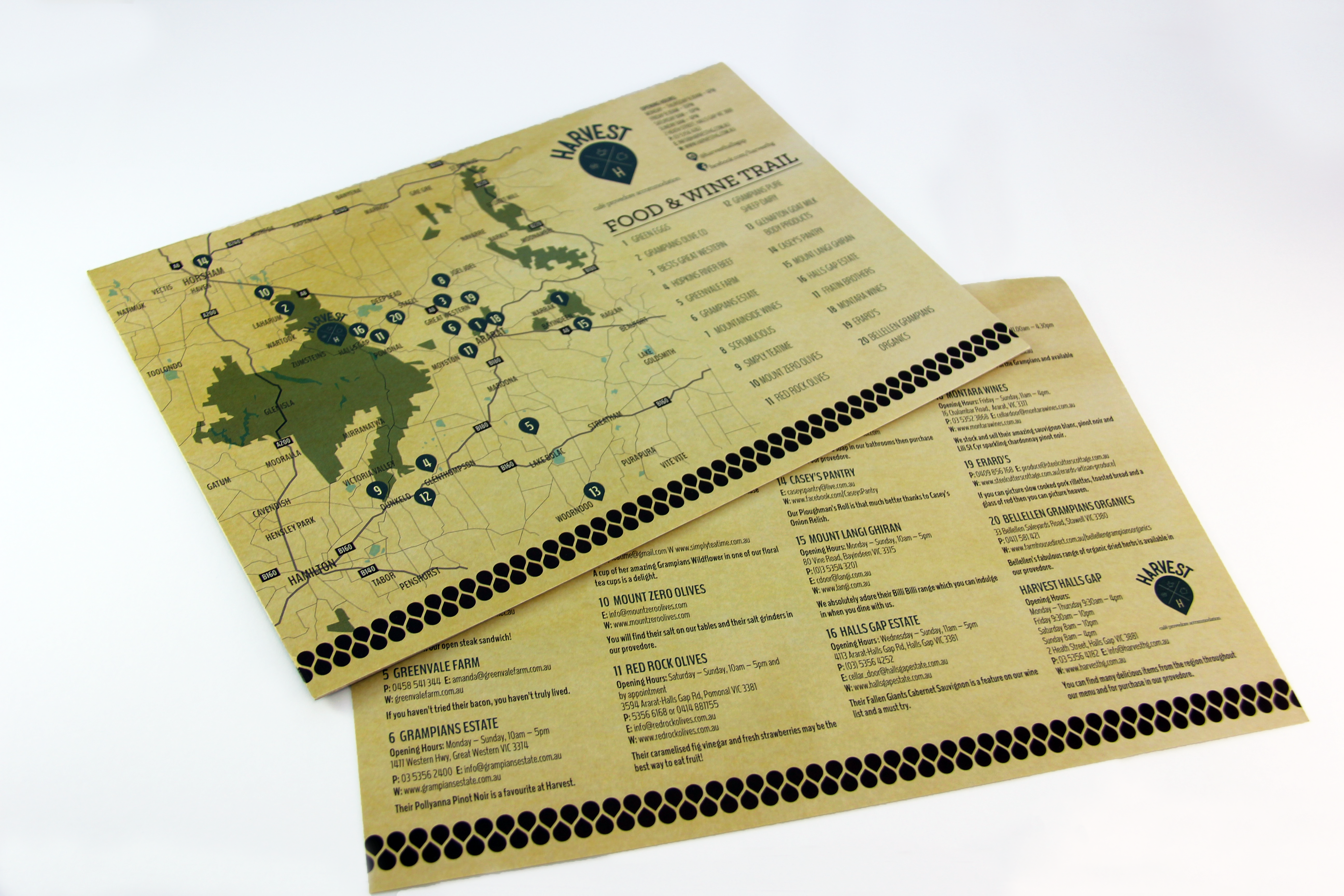
Premises, Fascia & Signage
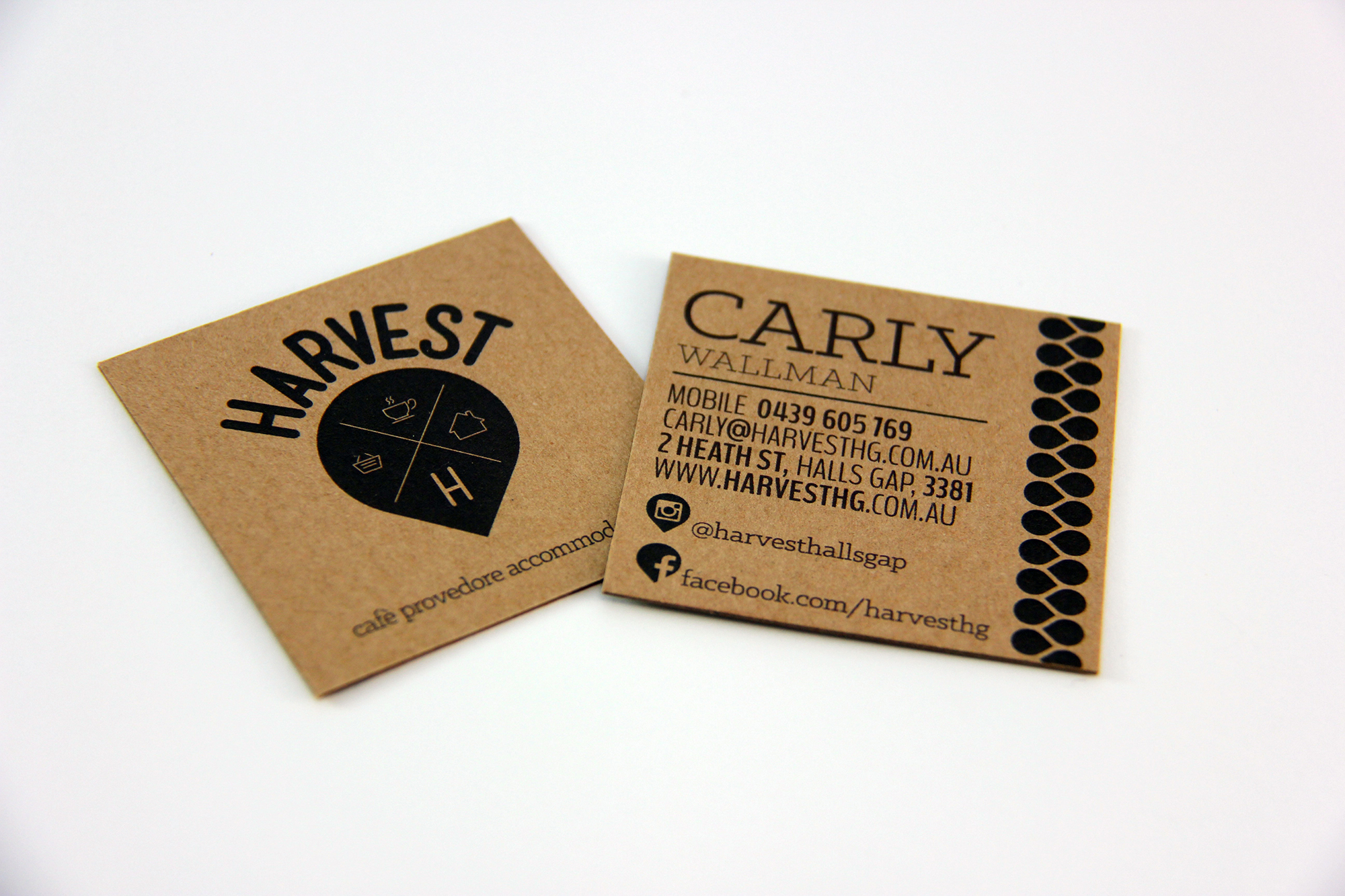
Stationery and Menu Design
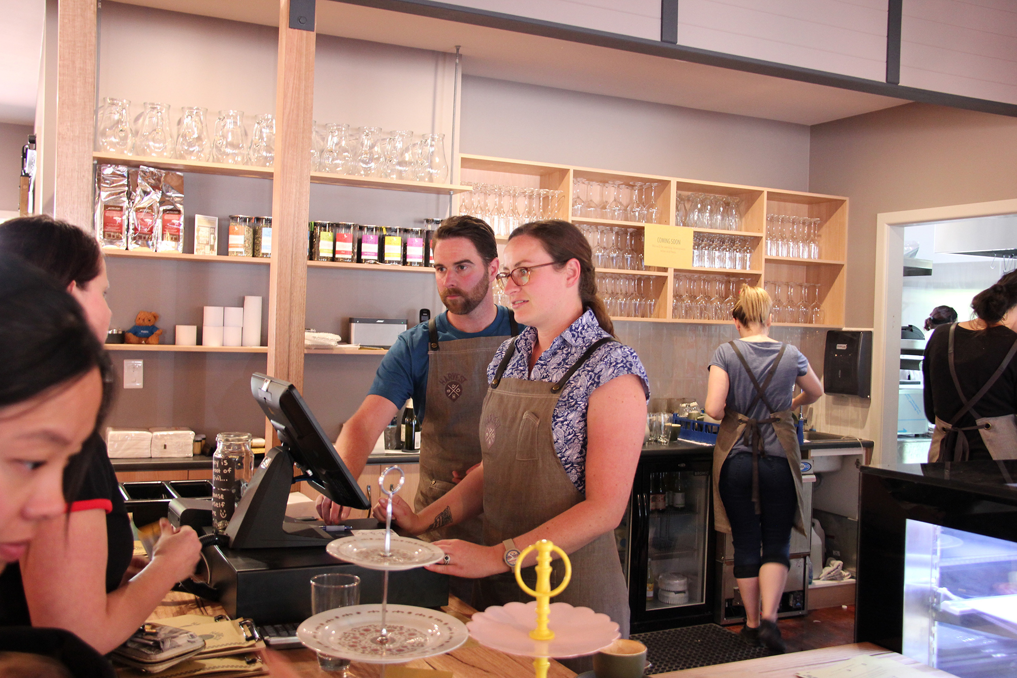
Staff Uniforms
Promotional Marketing


")


THE CLIENT
Wanting to evolve from paleo food into the natural health market dominated by females, we created a fresh new look that was uber clean and simple for this geo-based app.
THE CHALLENGE
When we met with Carly and Richard, they were in the throes of building the new cafe. We needed to translate their vision for the brand not only from the look and feel of their premises, but also their overall vision for the brand in order to bring it to life.
THE BRAND STRATEGY
Our Brand Strategy Workshop helped uncover some of the deeper objectives of the project which ultimately drove the creative direction.
We wanted to:
- Create a brand that was unique, but one that easily communicated the three different business streams that would operate from the one location.
- Bring awareness to the new Harvest brand and create a logo and design that evokes a feeling of quality, simplicity, community and agriculture.
- Create a logo that would be directly and visually connected with the Harvest brand
Create a logo and branding that could be used in a range of mediums across the cafe, provedore and accommodation.
THE OUTCOME
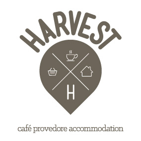
In order for a crop to Harvest, you first have to plant the seeds. This notion formed the basis of the design concept we created for Harvest – the logo quite literally was a seed, turned up side down. Something so simple, had so many meanings layered into it – the seeds the local farmers plant to later harvest local produce; the seed being symbolic of organic, natural food; the seed in the shape of a pin drop – Harvest as a tourist destination, a must see on your next visit to the Grampians. The play was so simple yet so delightfully obvious.
To communicate the 3 business streams, we used simple illustrations within the seed to communicate accommodation – (a bed) cafe (coffee) and provedore (shopping basket).
We used very natural colour palette to further promote that organic, natural feel and this also complimented the vision Carly and Richard had for the interior design of the cafe and accommodation.
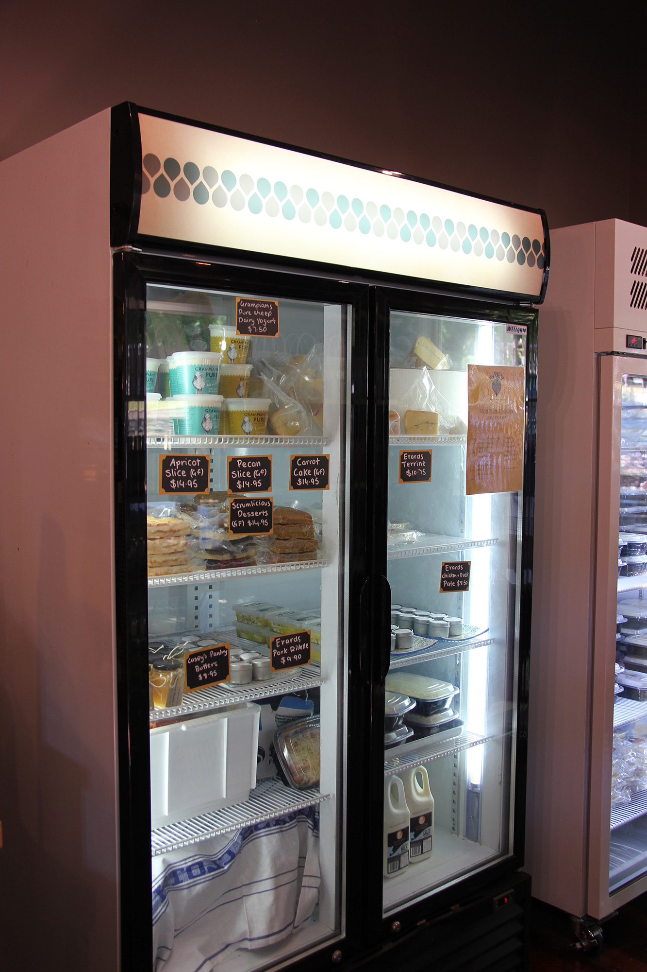
We also used the seed to create a very neat repeat pattern that could be subtly used as a motif through the cafe and on various marketing elements to further make the Harvest brand iconic and memorable.
CLIENT FEEDBACK
how the project was received
THINKING ABOUT RE-BRANDING?
WE'D LOVE TO HELP.
BRAND DISCOVERY CALL
Are you starting a new business, opening a cafe or launching a new brand? If so, we’d love to help you build an iconic brand like Harvest.
Book in for your complimentary 20 minute Brand Discovery Call today.
BEFORE
The old logo was difficult to read and didn’t reflect the prestige and true reputation of the company.
AFTER
The new brand is strong, stylish, striking and powerful. It literally stops traffic!
