Wanting to evolve from paleo food into the natural health market dominated by females, we created a fresh new look that was uber clean and simple for this geo-based app.


SUCCESS STORY: HEALTH HUNTER APP
A BRAND’S NEW DIRECTION: FROM CAVEMAN TO THE MODERN AGE.
CLIENT
Health Hunter App
PROJECT
Re-brand
& Re-name
PROCESS
Brand Strategy
Brand Identity
DELIVERABLES
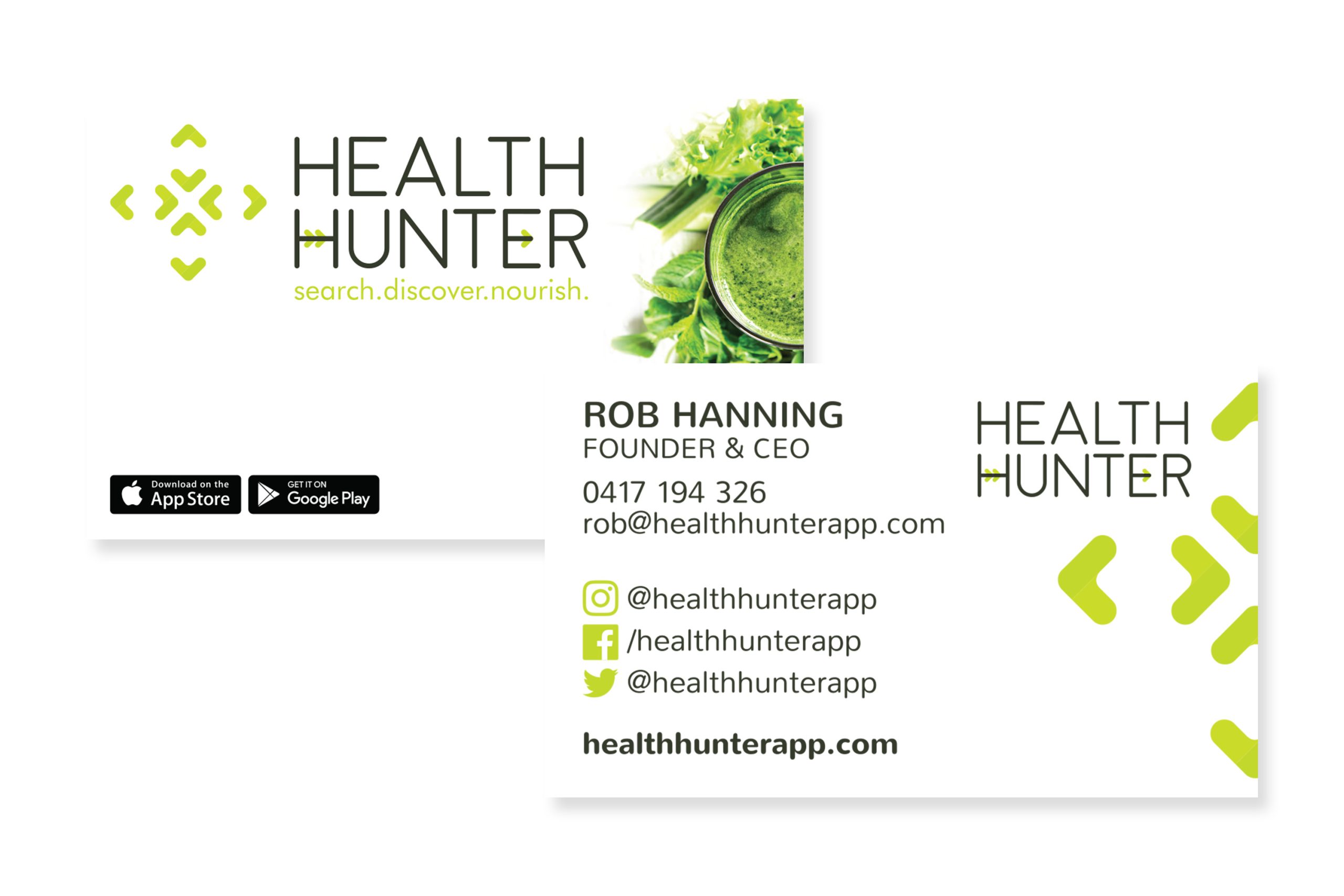
Logo Design
Corporate Stationery
App Skin Design
Advertising


THE CLIENT
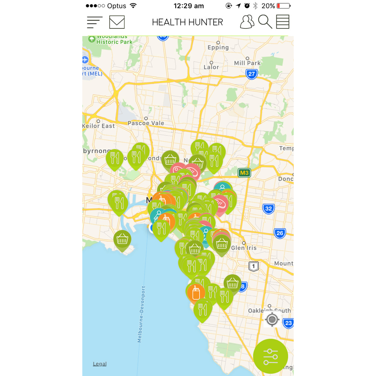
Health Hunter (previously Paleo Paddock) is a location based app that connects health-conscious customers with the best clean eating cafes, juice bars, wholefoods and other wellness pursuits.
THE CHALLENGE
Rob Hanning the founder of Health Hunter approached our team to re-brand his business and app. Originally named Paleo Paddock, the app was only focused on serving clients who followed the Paleo diet. Rob saw an opportunity in the market to extend the appeal of the app to all clean eaters and wellness seekers. The brand name, therefore, had to change, and the look and feel of the brand and the app had to appeal to a broader and more female-centric clientele.
THE BRAND STRATEGY
The focus of the brand strategy and brand identity was to create a look that was fresh, lively and clean – and almost minimalist, just like clean eating. We wanted to create a slightly techy feel whilst remaining feminine to bring people and places together with an app.
The logo icon represents the 4 global directions -north, south, ease and west and also acts as a reticule, to pinpoint/focus a specific location on a map.
THE OUTCOME
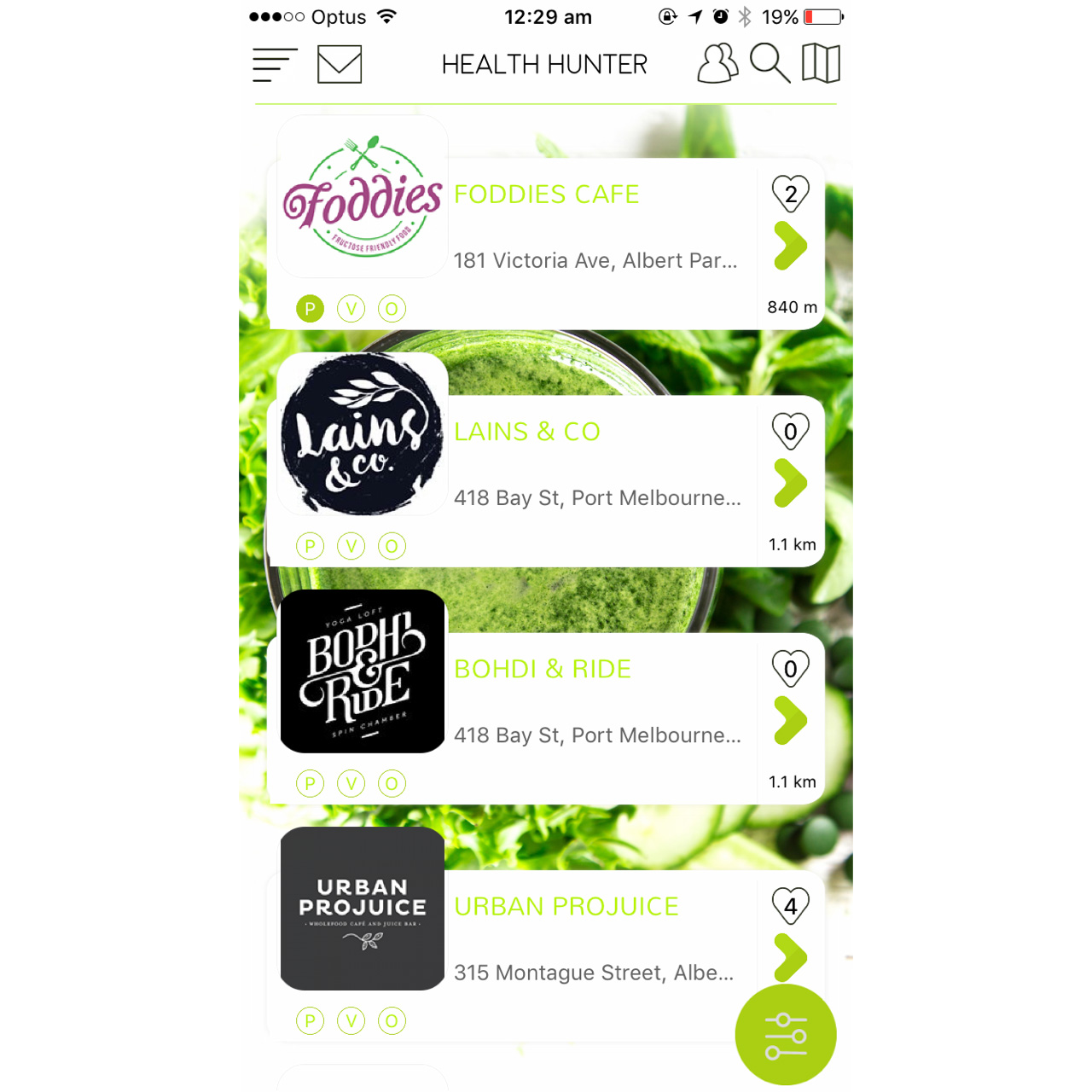
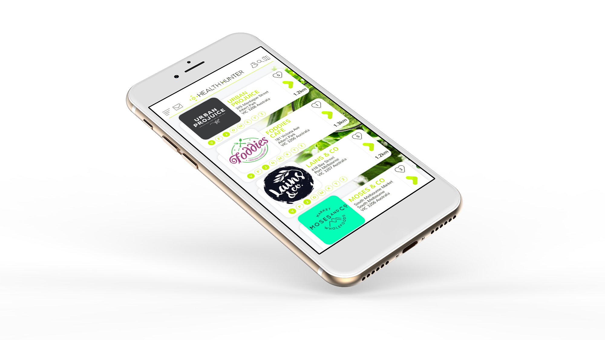
The app design is clean, with fresh, green raw imagery in the background. We wanted the focus to be on rounded edges and ghost whites, making the restaurant logos a core focus of the app.
The marketing collateral follow suit in the look and feel of the app, thus further re-inforcing the brand.
The tagline search.discover.nourish encapsulates the essence of the apps functionality as well as the final outcome for the end user – to nourish their body.
CLIENT FEEDBACK
how the project was received
THINKING ABOUT
RE-BRANDING?
WE'D LOVE TO HELP.
BRAND DISCOVERY CALL
Book in for your Brand Discovery Call and find out how our creative team can support you in building a meaningful, memorable, profitable brand.
BEFORE
The old logo was difficult to read and didn’t reflect the prestige and true reputation of the company.
AFTER
The new brand is strong, stylish, striking and powerful. It literally stops traffic!
