Our Journey Is My Reward is a memorable and uplifting memoir that journeys across oceans and will capture your heart from the first page. From living in his parents garage to sitting on corporate boards, Gerry’s journey is as entertaining as it is inspiring.
Gerry Lambert - Our Journey is my reward
Book Cover and Interior Design

CLIENT
Gerry Lambert
PROJECT
Ultimate Author Starter Kit
PROCESS
Development of his Book Cover Design,
Book Interior Design Layout and Formatting
DELIVERABLES
Book Cover Design,
Simple Book Interior Layout & Formatting,
Author Landing Page and WordPress Website Build,
Publishing Assistance & File Upload for Amazon & Ingram Spark


THE CLIENT
Gerry Lambert is the middle child of nine siblings. His parents migrated from the Netherlands to Australia after World War II. Our Journey Is My Reward is a memorable and uplifting memoir that journeys across oceans and will capture your heart from the first page. From living in his parents garage to sitting on corporate boards, Gerry’s journey is as entertaining as it is inspiring.
An insightful and at times humorous reflection on the ups and downs of family, friendship, hard work, life, love and loss.
THE CHALLENGE
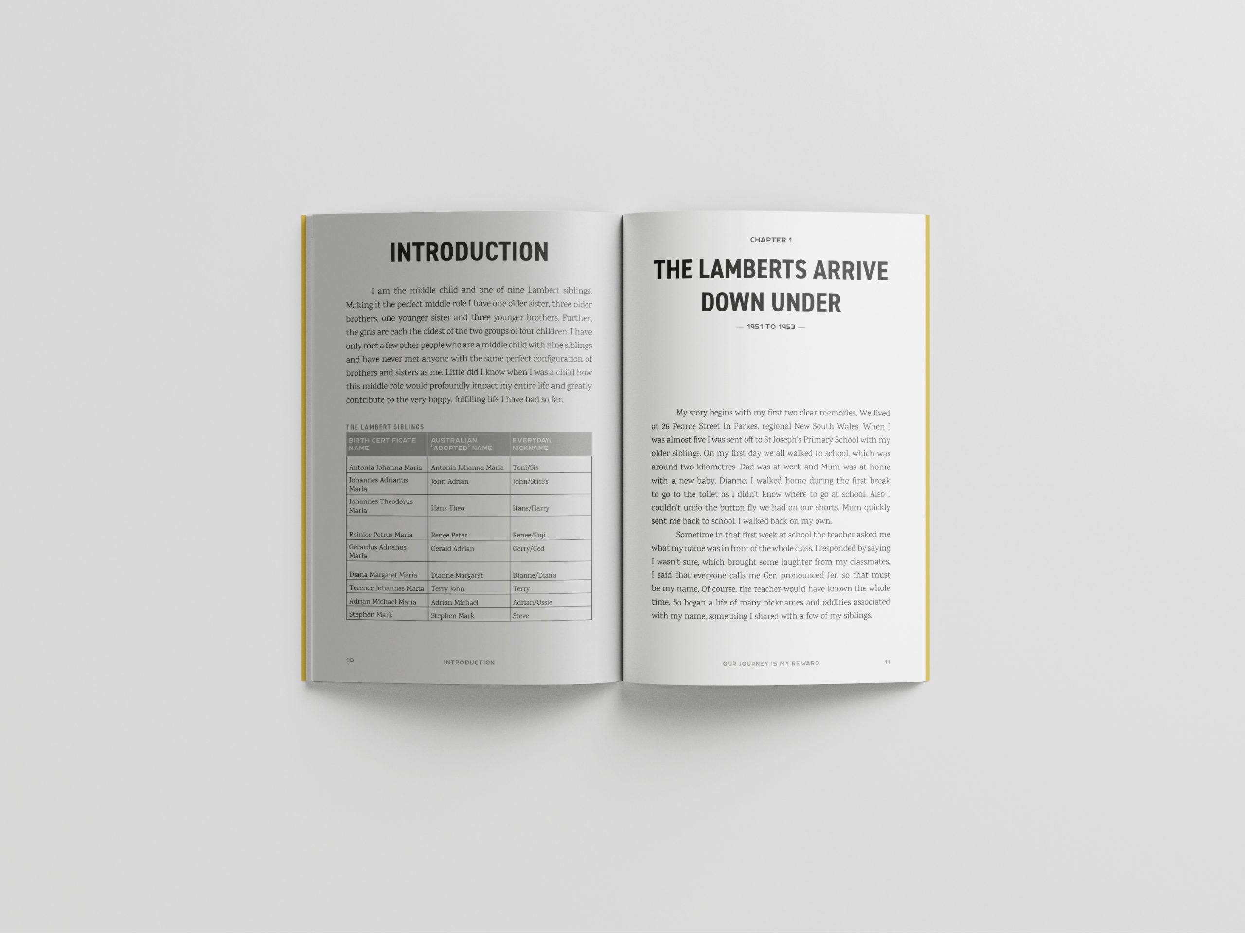
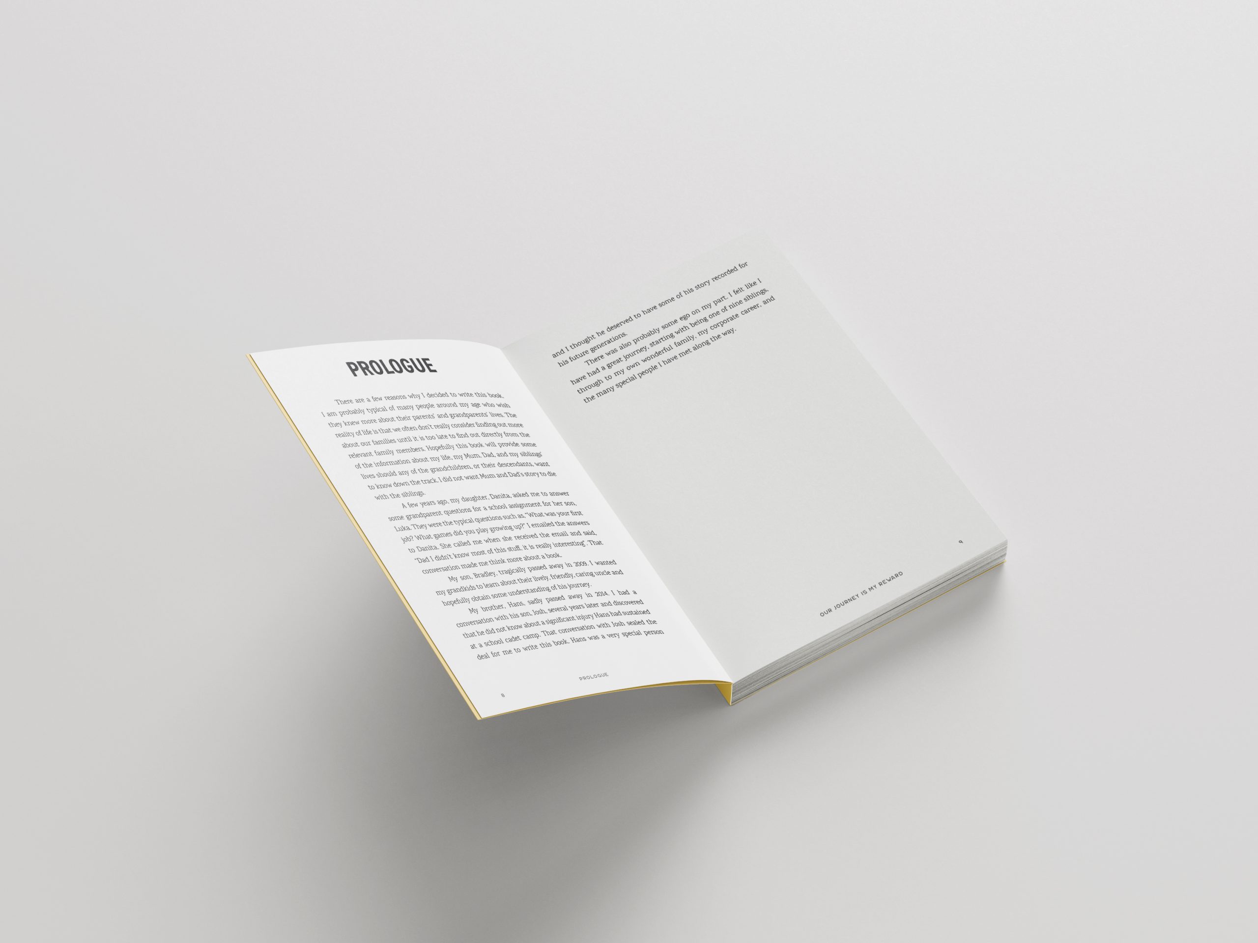
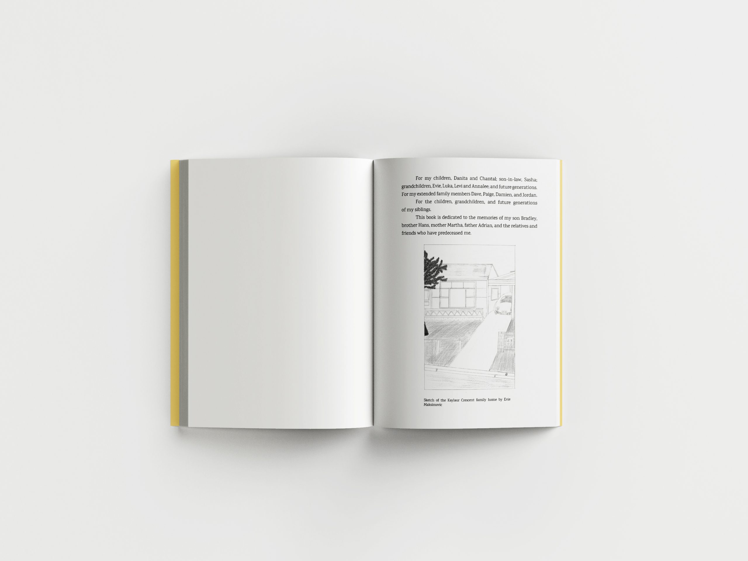
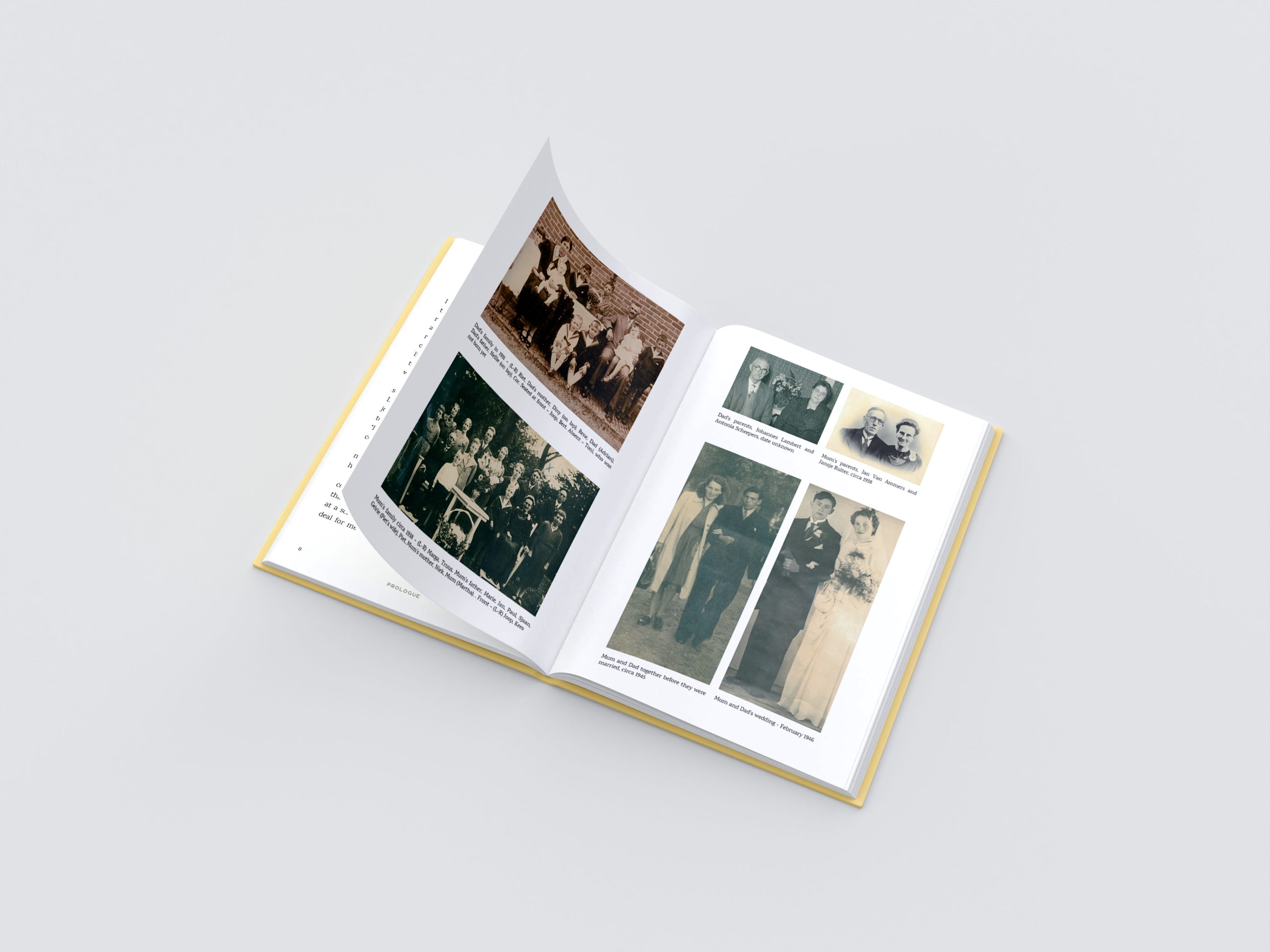
Quickly reading through Jerry’s 90,000+ word manuscript, I knew we had a beautiful book that needed a number of personal nuances to be captured to help Gerry tell his unique story. Being mostly text based, we suggested a simple book layout with the addition of black and white images throughout various sections of the book to further elaborate on the story and historical references.
The main challenge was to make the layout easy to read, particularly for an older audience which mostly compromised of Gerry’s very large extended family – the book was intended primarily for Baby Boomers and their kids.
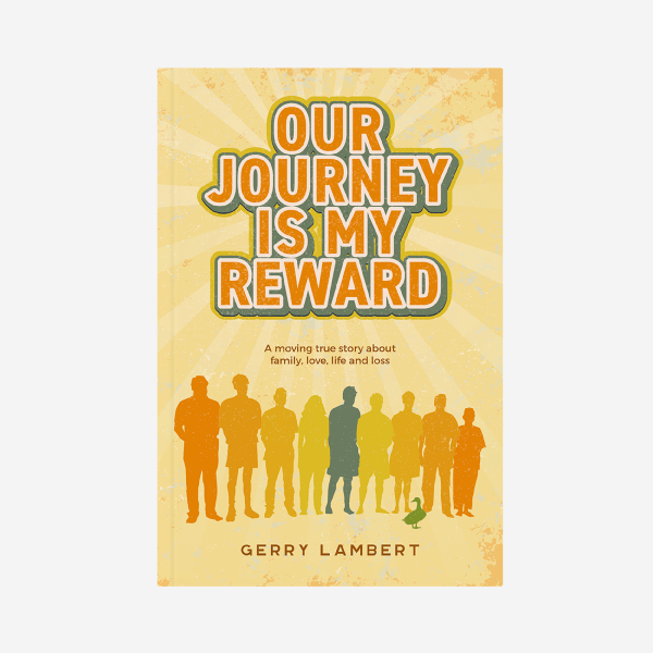
We also needed to create a compelling cover design that captured the essence of the story but one that was not too personal so that the book would also have commercial appeal outside of the Lambert family.
Gerry’s book also included a symbolic reference to duck that Gerry wanted to us to somehow capture – but you’ll have to read the book to find out the significance and meaning behind it.
THE BRAND STRATEGY
We worked very closely with Gerry during his extensive book project which included:
-
Book Cover Design
-
Simple Book Interior Layout & Formatting
-
Author Landing Page and WordPress Website Build
-
Publishing Assistance & File Upload for Amazon & Ingram Spark
THE OUTCOME
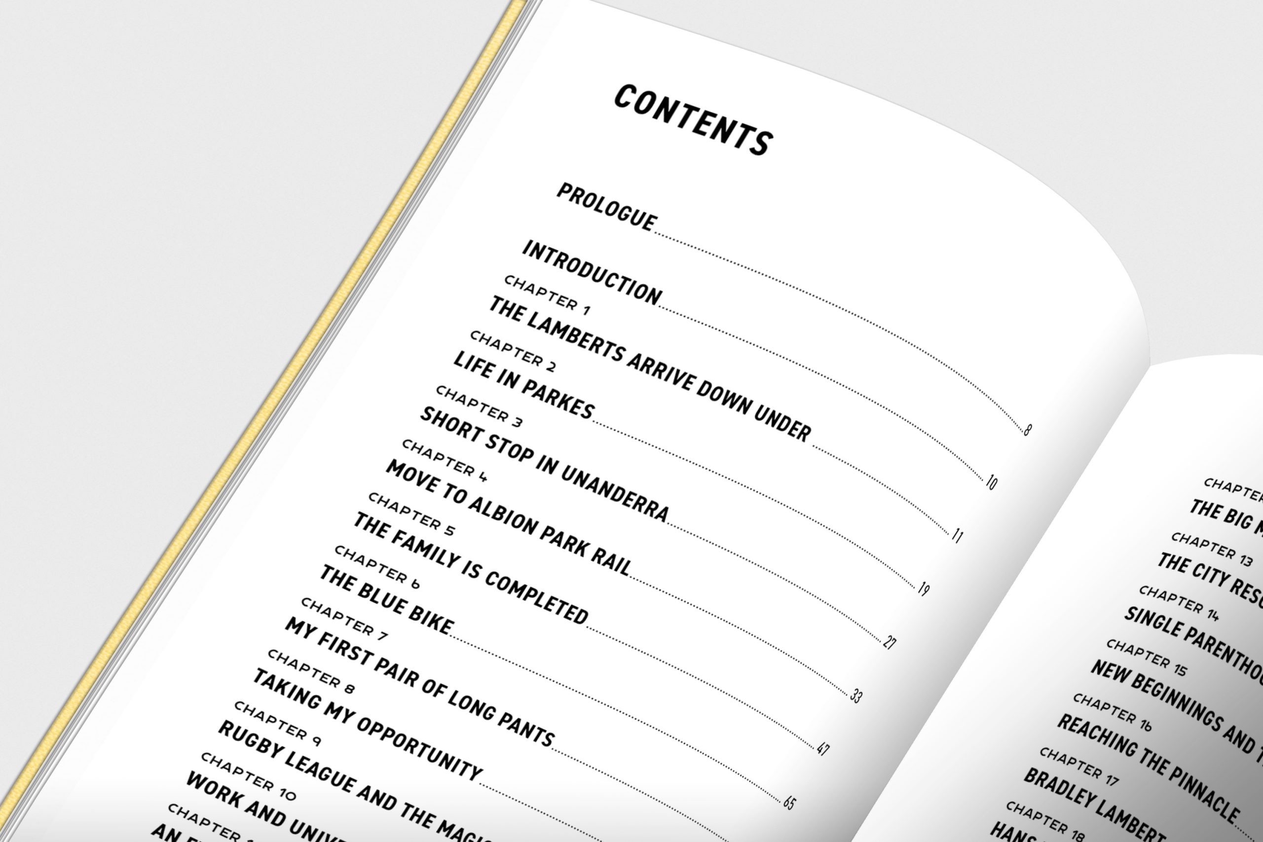
After developing multiple options and variations, for Gerry’s interior page layout, we settled on a simple book layout on a slightly larger than normal book size. We used a large beautiful serif font called Karma with lots of leading – allowing for easy reading. This brought Gerry’s book to a total of 355 pages which was a great achievement for a book of this length, bringing down his printing costs significantly.
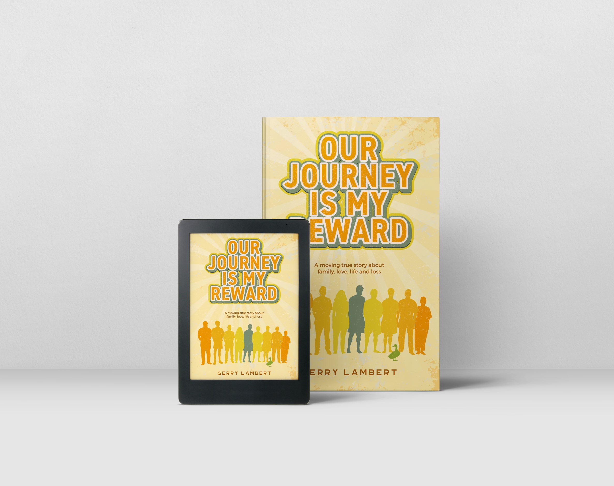
The cover design captured the family’s resilient attitude in the face of adversity utilising bright yellow, orange and green colours capturing the vibe of 1970’s music poster – communicating a joyous, happy journey. The 9 siblings were captured as silhouettes adapted from a family photograph as an illustration, with Gerry in teal green right in the centre. The symbolic duck was added at their feet.
Being a symbolic reference, we also used the silhouette of the duck through the rest of the book as section breaks within each chapter, so that the reader can pause, breaking up long stretches of text.
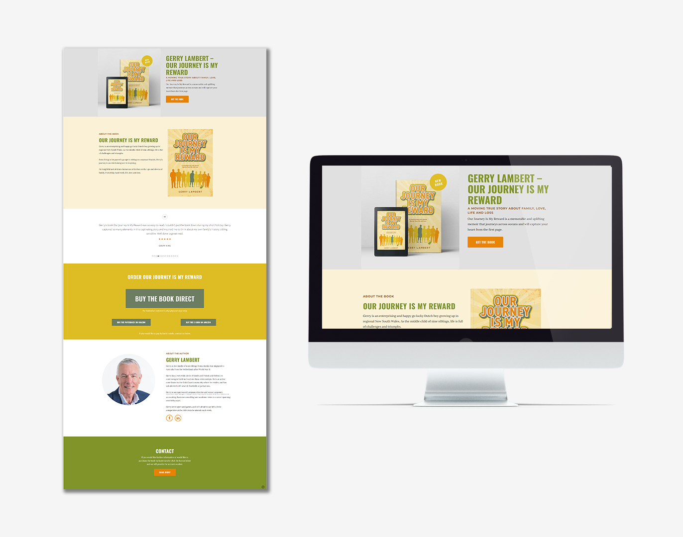
We also designed and built Gerry’s author website with shopping cart and set up his author profile on Amazon.
“I engaged Maja Wolnik, from Maja Creative, to design my book “Our Journey Is My Reward”. This brief encompassed the cover design, interior formatting and preparation for paperback printing and digital production. We extended the brief to include setting up the sales processes in the digital world. Maja really nailed the cover design. Everyone loves the cover immediately and they also quickly understand its significance. Maja’s cover design process was very thorough; this included interviews with me and reading the manuscript to really understand the purpose of the book. Maja surprised me with a very relevant symbol for the subject matter breaks and I have received the feedback “ I loved the ducks” many times. Maja and her team were a pleasure to work with. They were very professional and, as a first-time author, patiently guided me through the processes. I was extremely happy with the end result.” – Gerry Lambert, Author
FURTHER INFO
You can get a copy of Our Journey is my Reward through Gerry’s website gerrylambertauthor.com.au or through Amazon.
CLIENT FEEDBACK
how the project was received
THINKING ABOUT A BOOK?
WE'D LOVE TO HELP.
book discovery call
At Maja Creative, we take on a very limited number of new client projects each month, so that each project gets our full attention. Our spots are filling up fast for the remainder of the year, so get in now.
THE STRATEGY
We also needed to create a compelling cover design that captured the essence of the story but one that was not too personal. The main challenge was to make the layout easy to read, particularly for an older audience.
THE OUTCOME
The cover design captured the family’s resilient attitude in the face of adversity utilising bright yellow, orange and green colours capturing the vibe of 1970’s music poster – communicating a joyous, happy journey. The 9 siblings were captured as silhouettes with Gerry in teal green right in the centre. The symbolic duck was added at their feet.
